this is really a non-issue compared to everything else they get wrong, but the way these live-action remakes of animated movies have been translating their non-human characters to screen has been bothering me. you can see it with how to train your dragon, pinocchio, and more recently lilo & stitch: they keep the designs essentially unchanged, just with a more realistic rendering. on the one hand i honestly get why they do it, considering that 1) these remakes only exist to bank on nostalgia and on the novelty of getting to see a cartoon in ‘real life’, so the closer they stick to the looks of the source material, the better, 2) fans tend to get really really (sometimes irrationally) mad when people make even small changes to previously established designs of beloved characters, and 3) most previous attempts to make a cartoony design come across as more 'realistic’ have not been well executed (just look at the ugly sonic debacle)
but on the other hand, i cannot ignore how out of place some of these designs feel when brought to a live-action setting basically unchanged. they have more leeway than usual on this case due to the fact that these are non-human characters who are supposed to look fantastical and alien, but when you look at them in motion, you see they carry the style of the original work they came from all over them in a way that clashes with everything else.
like, pinocchio may be made of wood, but on the original movie, he was supposed to look very close to a 'real boy’, because that’s what real boys looked like on that movie. pinocchio did not look very different from lampwick, for instance:

compare that to how he looks next to live-action lampwick:
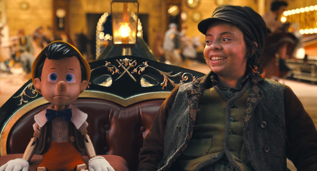
it looks like lampwick is hanging out with a possessed doll. that’s not the vibe the movie or this scene should have. and the same goes for stitch and every other alien on that movie – they were not supposed to look human, or even humanoid on stitch’s case, but they all clearly carried that distinct art style of chris sanders. looking at the original lilo and stitch standing next to each other, you see they both carry similar proportions in how their heads are shaped:

which, again, doesn’t make stitch look more 'human’, on this case, but it does make him look like he belongs to that universe, because that’s how things look like there; that’s how heads are drawn and how eyes are spaced. the same logic applies to jumba too, for instance. and when it comes to the live-action version:

stitch’s design looks way more 'unreal’ next to a real girl, less like a weird animal that could possibly exist in real life and more like a plush toy that talks.
i don’t actually expect them to ever to something different, really, since changing it would be kind of just an unnecessary and risky move on their part, but it does bother me how so many fans apparently just eat this stuff up without feeling even a little weirded out by how it looks. does stylization mean nothing to you people