bacchianas:
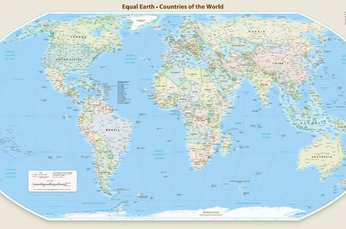
hii new official world map just dropped
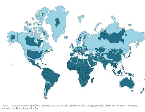
comparison (in deep blue you can appreciate the real size of countries):
this is the result of a campaign by the African Union to correct disproportionate cartographic representation due to the use of the mercator projection.
Only the US voted against the resolution.
this illustration confuses the message a little, because it makes it look as if the Mercator projection didn’t actually distort Africa itself at all, just made Greenland so ridiculously huge that nearly everything else looks smaller by comparison
Anyway I like the xkcd comic about a Mercator projection framed to exaggerate the size of Madagascar specifically
(really tho i think for accuracy’s sake we should use more globes instead of flat maps but i admit this is not always practical)